I had four going at the same time -- MacRumours, CNET, MacWorld and Engadget. I know there were others, but I was worried about bogging my system down so much nothing would run properly.
They all had a slightly different take on delivering the goods. Three of the sites were also posting pictures in real time, so it was almost like seeing video. (CNET elected not to show any pictures.) CNET and Engadget had some server problems. Both went down for awhile at the beginning, but were OK by the end.
MacWorld had the best writing, although it was a little slower delivering the news. But as with most of their coverage, it was well written and offered more detail. Engadget's Ryan Block was more opinionated, offering his comments along with coverage. The CNET blog, by Tom Krazit was fairly straight up. I found it the least interesting.
The MacRumours blog was the most straight-forward. "Just the facts, ma'am." The updates were simple but timely. There were lots of pictures to go with the slimmed down coverage. But what made it useful was that the site was continuously updated. Once I loaded the page, it updated all the time. I didn't have to hit the refresh button at all. That was a nice touch. The others all required refreshes to see the latest content.
The sites also delivered the latest content slightly differently. MacWorld used a traditional top to bottom format, with the most recent news at the bottom of the page. But when you refreshed the page, you were taken to the end, so the copy all read in the right order. It was the most useful for catching up with.
Engadget posted all the latest updates at the top of the page, but they had a big photo at the top, so the updates were below that and I had to page down to see them. If you wanted to read a few updates at a time it was a bit awkward, because you needed to look above the one you were reading for the next one.
The other problem with Engadget's site was that it was so ad-intensive, it took a long time to refresh and often lost the server connection before it had finished downloading everything. That was annoying.
CNET also posted their most recent updates on the top, but their format made it a little easier to distinguish which update was which.
So what about the content? It was very, very impressive.
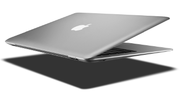
Jobs announced a new version of the Apple TV software, which will allow you to rent movies and watch them on your TV. There's upgrades to the IPhone software (which will also be available on the ITouch), there's a new device called Time Capsule, to complement TimeMachine. And the finale was the introduction of the MacBook Air -- the world's thinnest laptop. You have to see this thing to believe it.
I want one right now -- and an Apple TV -- and a Time Capsule -- oh, and an IPhone too!
You can see all the details on the Apple site right now.
No comments:
Post a Comment